


As the company scaled, our design and engineering teams grew apart. We were shipping faster, but breaking more. The product suffered from "UI Drift" slight inconsistencies that eroded user trust and slowed down development.
Faced with fragmented designs across multiple teams and agencies, I initiated and drove the creation of our first unified Design System, significantly improving cross-functional consistency, reducing technical debt, and accelerating design-to-development cycles by 40%.
Team & Responsibilities
I acted as the product owner for the system itself, treating the internal tool as a client-facing product.
| Defined the governance model, led the UI audit, and managed the roadmap. | |
| Built the Figma component library, wrote usage documentation, and defined accessibility standards. | |
| Managed the integration roadmap with feature teams (ensuring adoption didn't stall feature work). | |
| Built the React component library and set up the design token pipeline. |
The Challenge
We were reinventing the wheel every sprint.
The "Entropy" Problem:
Inconsistency:An audit revealed we had 14 different shades of gray and 6 different primary button styles in production.Slow Handoff:Engineers spent hours inspecting custom CSS for elements that should have been standardized.Onboarding Friction:New designers took weeks to ramp up because there was no "single source of truth."
The Impact
"Atlas" became the backbone of our product development.
40% Faster Velocity:Engineers stopped writing custom CSS for basic elements, allowing them to focus on complex logic.Reduced Tech Debt:We deleted over 2,000 lines of redundant CSS code in the first quarter of adoption.Unified Brand:We achieved standard user accessibility across 95% of the platform.
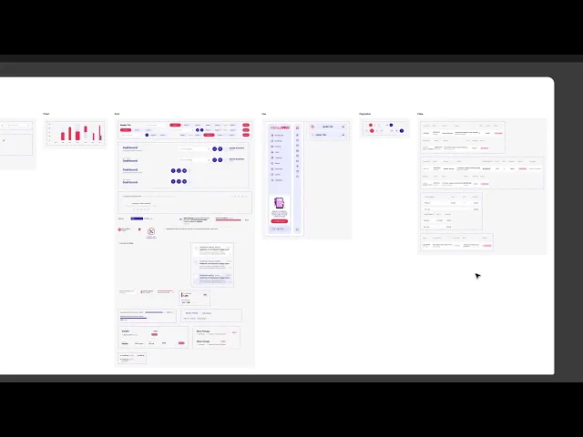
The Design Proces
The Audit (The Evidence)
Before building, I had to prove the problem. I conducted a comprehensive UI Inventory.
I printed out every variation of our UI elements and pinned them to a physical board. The visual impact was undeniable we had a "Button Graveyard." This audit became the catalyst for getting executive buy-in.

Defining the Physics (The Principles)
We didn't just want a sticker sheet; we needed a philosophy. I established three core principles to guide every decision:
Clarity over Cleverness:Components must be intuitive first, beautiful second.Accessible by Default:No component enters the library without passing contrast and screen-reader checks.Flexible but Finite:Provide options (Small, Medium, Large), but forbid arbitrary customisation

3. Architecture & Tokens
We utilized the Atomic Design Methodology to organize the system.
We moved away from hard-coded hex values to Design Tokens (e.g., color-primary-500). This allowed us to update our entire brand palette in code with a single line change, future-proofing us for Dark Mode.

4. Governance & Adoption (The Culture)
A design system fails if no one uses it. I treated the roll-out like a marketing campaign.
The "Pilot" Squad:We didn't force it on everyone at once. We paired with one feature team to beta-test the components in a live build.Office Hours:I hosted weekly "System Doctor" sessions where designers could ask how to use a component or request a new one.Contribution Model:We created a clear flow for how a designer could "upstream" a new component, ensuring the system evolved from the bottom up, not just top-down.
Key Takeaway
A design system is not a project; it's a product. By shifting the conversation from "pixel perfection" to "operational efficiency," I was able to secure the resources needed to build a system that allows us to scale indefinitely.

Abi Arulraj
Designer
Loading weather data...
Available